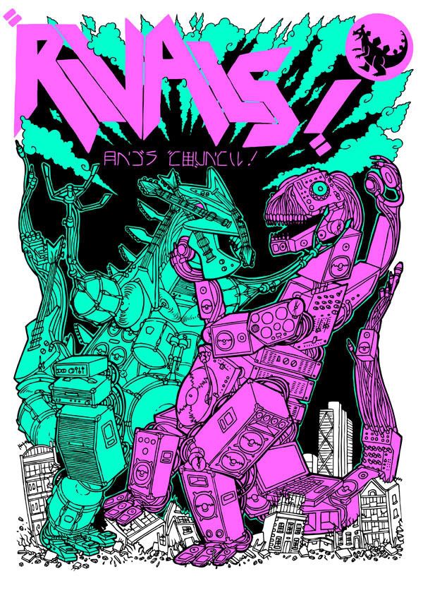
This is my illustration for the Rivals club night in London which will be going onto flyers and Posters. I made the image to look like a cover to a Godzilla type film with rival dinos made up of different kinds of musical instruments. On one side is one representing Rock made of guitars, drums and amps etc and on the right one representing electronic music made up of decks, CDJ's, speakers etc.
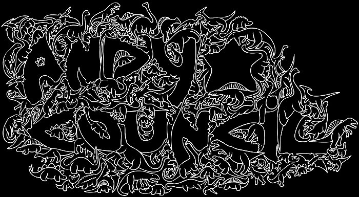
I managed to sneak my name into the flyer by making it look like some kind of Japanese writing! Beneath the dinos are buildings representing the Hoxton area of London where the night is held. One of the buildings is the White Cube gallery!
I was worried that this image would work for a bit as before colouring it looked like a pile of junk rather than two rubber suited battling dinos. The colour really helped to seperate them and I think this colour scheme works well. The colours on the flyer and poster have been changed to green and purple, which look pretty cool too! Check out Rivals on Facebook and Myspace for more info on the nights.


1 comment:
I love the purple one's face - it looks really like a monster suit - and that's something I can really embrace.
Post a Comment